Apple arguably creates the finest and innovative GUI in the industry. My favorite is the Aqua Interface from OS X 10.5 (Leopard) to OS X 10.9 (Mavericks). OS X Leopard's pixel-perfect design enthralled me the first time I saw it on a Mac Format magazine 2007 issue.
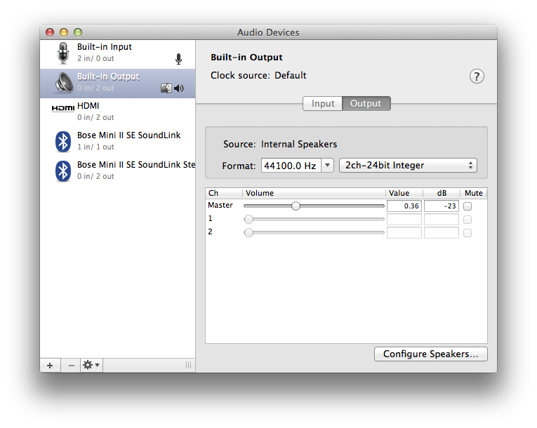
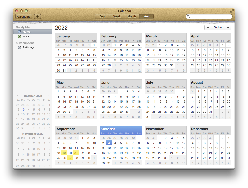
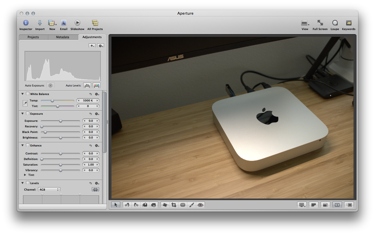
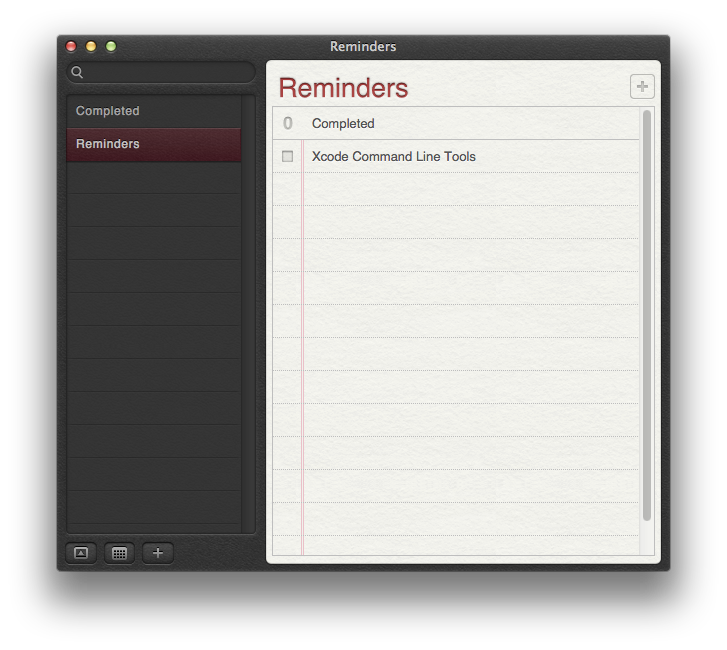
The Aqua interface first appeared on OS X, and has changed frequently over the years. The design from the first version of OS X to 10.9 (Mavericks) is mainly skeuomorphic.

Skeuomorphism imitates aesthetics of physical objects. Researchers state that newer technologies that resemble their predecessors give people comfort and ease of learning during the transition.
Opponents state that skeuomorphic UIs take up more space, cause inconsistent look and feel between applications, and increase cognitive load with unnecessary visual noise. It can also limit creativity by grounding the user experience to physical counterparts and are often wrongly imitated (e.g. analog gauges on digital interfaces.)
Interestingly, internal politics in Apple influenced its software design. Scott Forstall was the proponent of the skeuomorphic design, which was also favored by Steve Jobs. When Jobs died, Forstall lost foothold in Apple and resigned. Jony Ive took over the Human Interface team, shifting iOS and OS X from skeuomorphic to flat design.
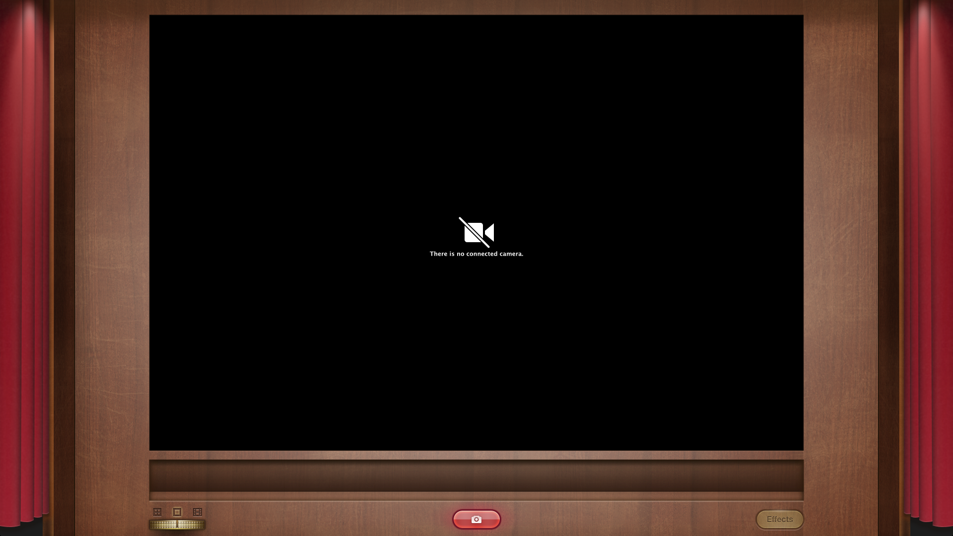
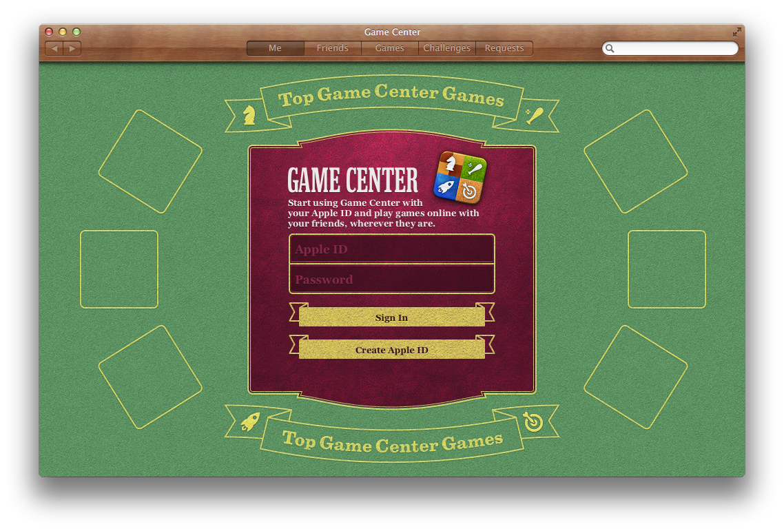
Apple causes conniptions among designers when they use outdated visual metaphors, like the Photo Booth App in OS X 10.8 and Podcasts App in iOS 6.
I believe that skeuomorphic design is better when done appropriately. Imitating physical objects should be avoided, but applying a subtle skeuomorphism to certain UI and visual elements, such as buttons and textbox, would help them stand apart from the contents.
To me, the OS X 10.5 to 10.9 Aqua UI still has the most comfortable and pleasing aesthetics among Mac OS.